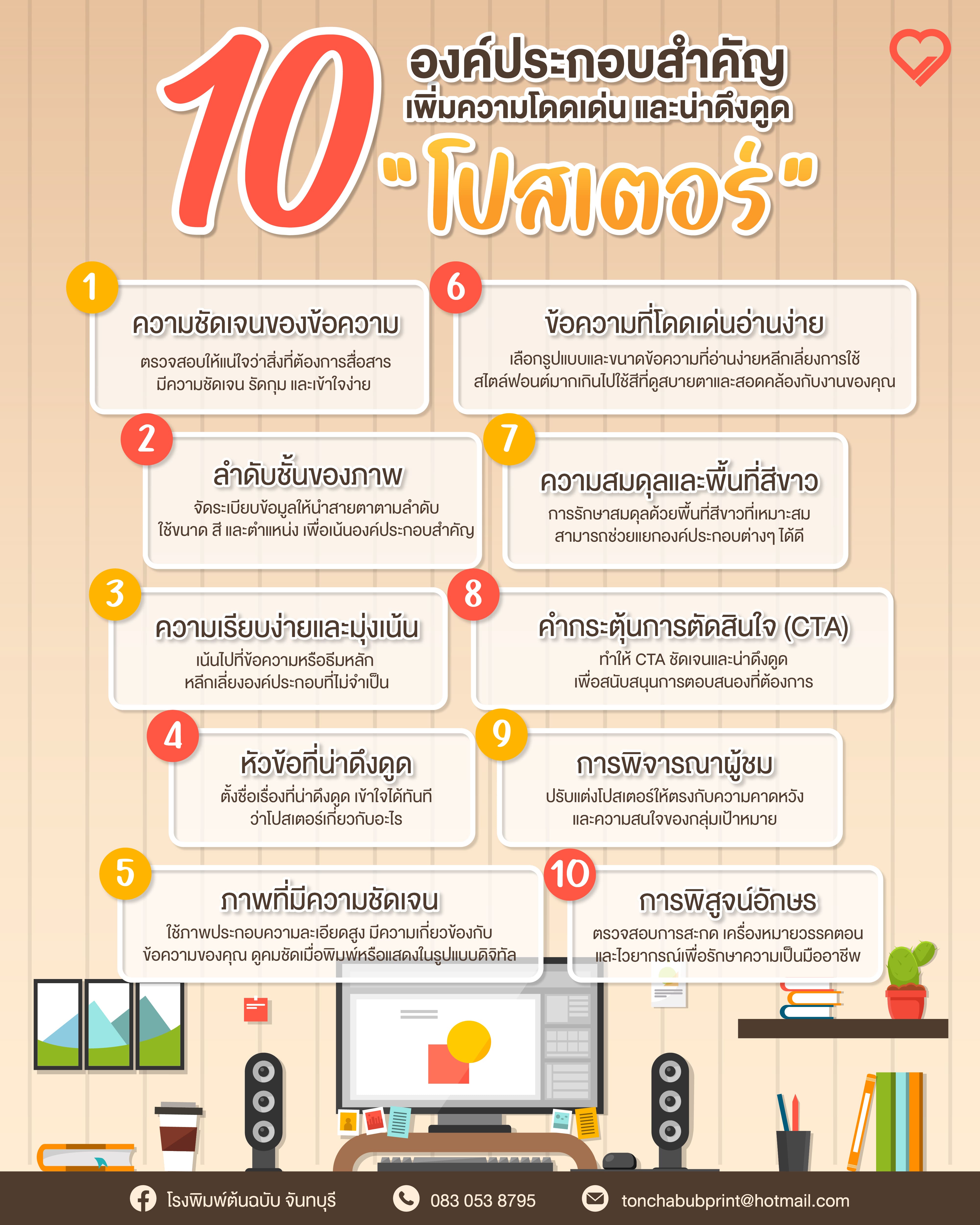
1. A poster must communicate a clear message
The core goal is to communicate clearly—easy to grasp and unambiguous. Clarity helps viewers quickly understand the purpose, importance, and key points without extra effort.
2. Visual hierarchy
Arrange and present elements to draw attention and guide the eye logically. Emphasize the most important content using size, color, and placement.
3. Simplicity and focus
Focus on the primary message/content. Avoid distractions and unnecessary elements.
4. An attractive headline
The headline is the first touchpoint. A compelling title grabs interest instantly and tells viewers what the poster is about.
5. Clear, relevant imagery
Use high-resolution images/graphics relevant to your message, sharp in print and digital. Good visuals evoke emotion and leave a strong impression.
6. Legible, standout typography
Choose readable fonts and sizes; avoid too many styles. Ensure sufficient contrast between text and background. Pick harmonious, comfortable colors and use them strategically for emphasis and consistency.
7. Balance and white space
Key to a balanced layout and to preventing clutter. White space separates visuals, text, and graphics, making the poster more appealing.
8. Call to Action (CTA)
On posters, this is a concise, engaging prompt. If you want action, make the CTA clear and attractive; use action-oriented language to drive the desired response—attend an event, visit a website, purchase, or join an initiative.
9. Audience consideration
Tailor the design to your target audience’s expectations and interests.
10. Proofreading
Check grammar, spelling, and punctuation for correctness and appropriateness to maintain professionalism.