
In today’s digital era where most interactions happen on screens, a business card might seem like just a small piece of paper, but it remains a powerful business tool. It plays a key role in creating a strong first impression and represents your brand in front of clients. This article shares 15 business card design tips to help your brand stand out even in a highly competitive market.
Although we’re talking about “business cards,” many of these tips can also be applied to other print media to make them more engaging.
1. Make your logo clear and prominent
Your logo is the face of your brand. Positioning it prominently and in balance on the card helps customers remember you more easily. Use a high-resolution logo and place it where the eye lands first—such as the top-left corner or the center.
2. Use colors that reflect your brand identity
Choose tones that fit—vibrant for creative businesses, or subdued for legal/finance. Colors should align with your corporate identity and stay consistent with other media such as flyers, brochures, and postcards.
3. Choose readable, modern fonts
Type influences perception. Opt for clear, legible fonts at appropriate sizes, such as TH Sarabun, Anuphan, or Kanit.
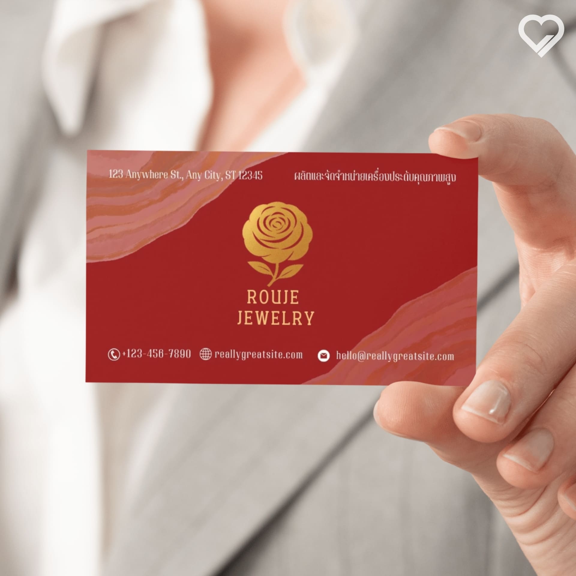
4. Don’t overload with information
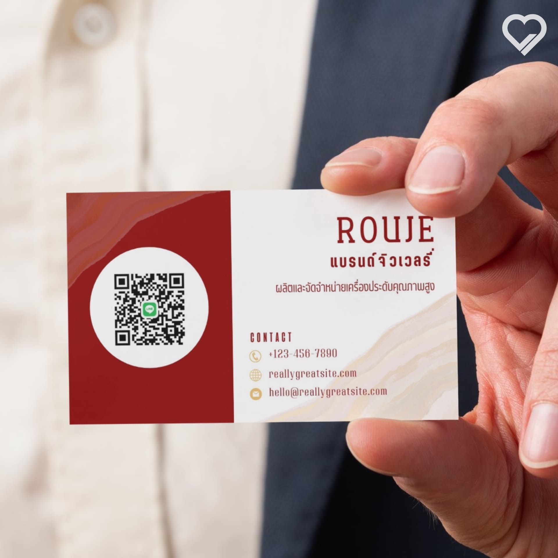
Show only essentials: name, title, phone, email, website, and/or a QR code. Avoid long promotional text.
5. Use a QR code to bridge to digital
Link to your website or social channels to make follow-ups easy and reduce lengthy on-card text.
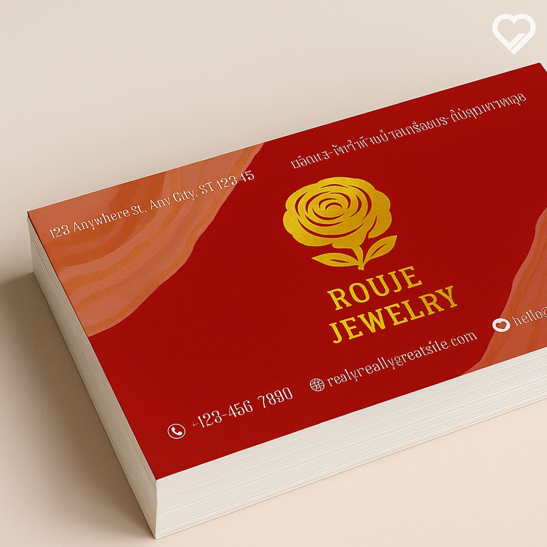
6. Choose quality paper stock
Use at least 250 gsm. Add gloss/matte lamination or Spot UV for a premium feel.
7. Standard size vs. creative sizes
The standard is 9 × 5.5 cm. If you want to stand out, try square, round, or die-cut shapes—but keep it pocket-friendly.
8. Use both sides
Add extra info/graphics on the back—like a map or QR code.

9. Balance your layout
Maintain comfortable margins. Don’t push elements to the edges or cram them together.
10. Add special finishing techniques
Consider embossing, foil stamping, Spot UV, or special inks to create a memorable highlight.
11. Proof before mass production
A print proof helps verify color, placement, and sharpness before you order in volume.
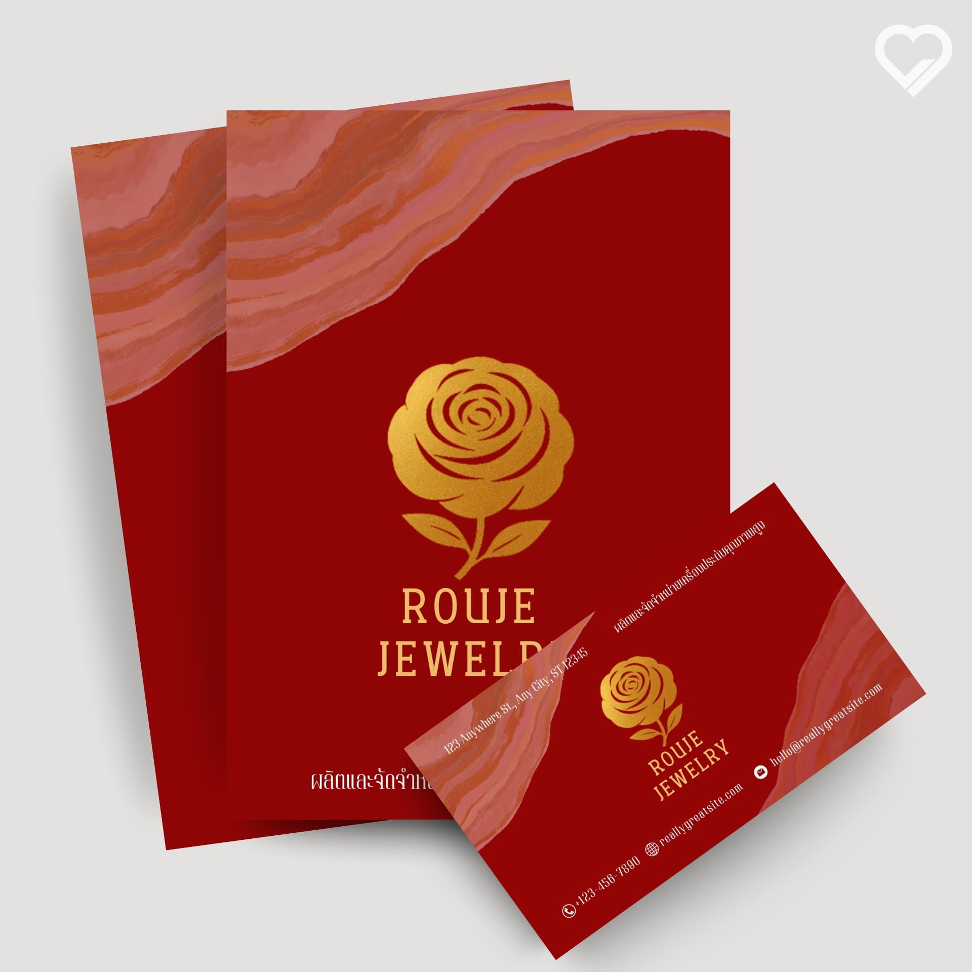
12. Stay consistent with other brand media
Colors, type, and style should align with your website, posters, and magazines to build a cohesive image.
13. Design with your audience in mind
Youthful markets may suit bold colors and playful graphics; corporate clients expect more formal tones. Match their expectations.
14. Mind the small details
Check kerning so letters aren’t too tight or too loose, ensure a sharp logo, and balance your colors.
15. Consult a print expert
Consult a seasoned print house—such as Tonchabub (Chanthaburi)—to get the best value and quality.
Summary
Business cards remain a vital tool for credibility and a strong first impression. Good design helps your brand stand out and be remembered. These 15 tips also apply to other print media—like magazines and newsletters—to elevate your brand across every touchpoint.